

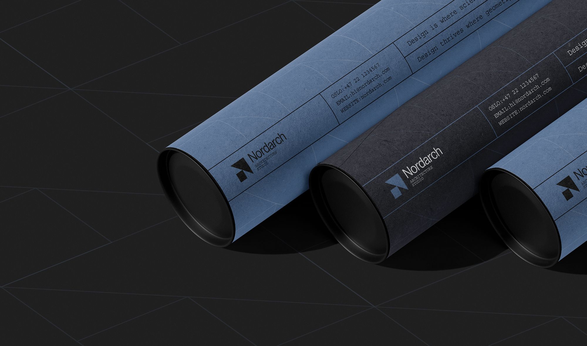
Nordarch
Visual identity and editorial system for an architecture studio
Nordarch is an architecture studio working across residential and cultural projects.
- Discipline
- Visual identity / Editorial design / Web design
- Timeline
- 12 weeks
- Client
- Nordarch
- Year
The problem
An architecture practice publishes more than it builds.
Between competition boards, planning documents, drawing tubes and a monograph, the studio produces far more printed matter than buildings. Each piece had been set by whoever made it, so the practice read as several practices.
The approach
One system, held across every format.
The identity is a typographic grid rather than a logo — a fixed measure, a fixed set of rules, and a single family that survives being printed at A0 and read at A5. The mark is the least of it.
Colour carries the sorting: blue for drawings and documents, black for everything the practice puts its name to.